


Pantone Colour Predictions for 2017
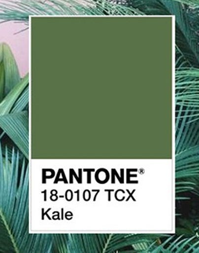
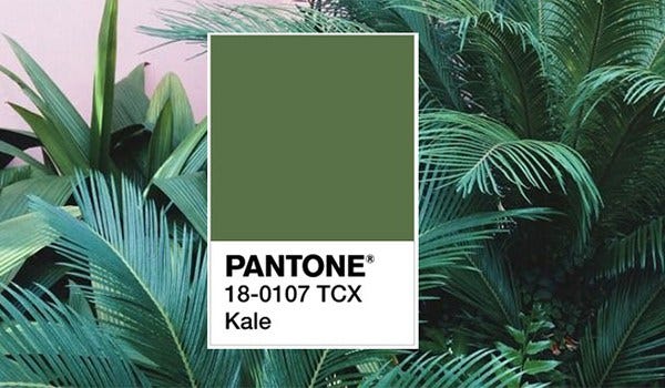
It seems the leafy green goodness we put in our detox smoothie’s on ‘good intention Mondays’ has left the blitzer and hit the catwalk and home interiors alike.
Kale is evocative of the outdoors, mother-nature, cleanliness and wellbeing. A rich green foliage colour, lush and fertile; which provides the perfect complementary background to the other more vibrant tones for 2017 that sit alongside it in the latest palette.
Conjuring up our desire for nature connection even more and accompanying kale is ‘Greenery’, a more vivacious green hue. Along with warm, muted hazelnut and Pale Dogwood; soft blues Island Paradise and Niagara, and the more zingy tones Primrose Yellow, Lapis Blue, Flame and Pink Yarrow complete the trend.
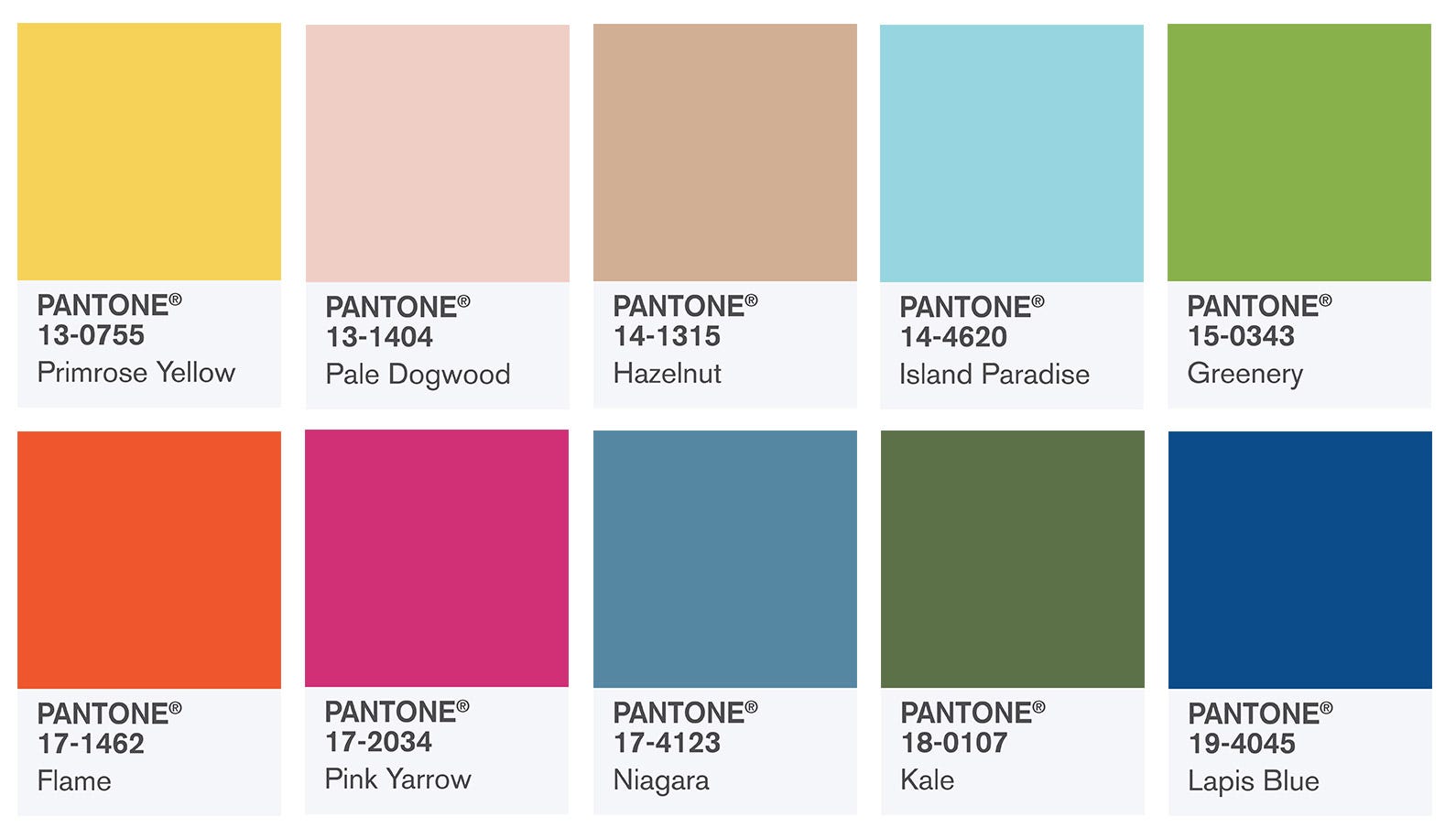
Primrose Yellow 13-0755: A buttery, sunny yellow and was seen throughout the runway collections.
Pale Dogwood 13-1404: As per the flower it’s named after, dogwood is a muted shade of dusky pink.
Island Paradise 14-4620: Likened to a tropical, airy blue, this is the ultimate colour associated with paradise.
Greenery 15-0343: A vivacious yellow-green shade perfect for brightening up autumn.
Flame 17-1462: An easy zesty colour to pair with a variety of colours bright or moody.
Pink Yarrow 17-2034: Vibrant and bold, bordering on a magenta tone, the perfect bright for fashion and home.
Niagara 17-4123: This soft blue hue has been ‘dreamlike.’
Lapis Blue 19-4045: A touch brighter than your average navy tone ‘Lapis Blue’ is similar to the stone lapis lazuli, bright and sophisticated.
The seasonal predictions are made following on from the runway collections at New York Fashion Week year on year, and applied to fashion, home interiors and anything else with huge colour impression!
Prepare yourself for these colours to make impact in 2017; it looks like next year will be as cool and colourful as we all hoped and not forgetting ‘healthy’ with Kale keeping us all on the ‘Wellbeing’ track!


